
Para Pickup
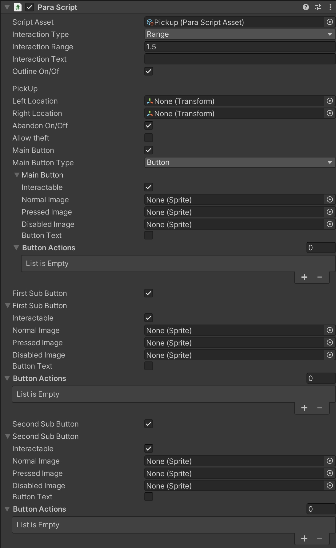
Pickup Object Component:
When the component is mounted to an object, the object's outline is displayed when something enters the object's interactive range. When the interaction button is clicked, the object is picked up, and then the custom operations performed on the object are shown.
Interactive range:
| Interaction Property Name | Property Description |
|---|---|
| Range | By selecting this type, you can generate a ball-shaped collider at the center of the object. Enter numbers to change the size of the range. |
| Area | By selecting this type, you can go to Interaction Collider and drag the custom collider to define the interactive range. |
Interaction Text & Outline:
| Interaction Property Name | Property Description |
|---|---|
| Interaction Text | Enters the text to be displayed on the interaction button. |
| Outline | When selected, the interactive object's outline will be displayed once something enters its range. |
Pickup:
| Interaction Property Name | Property Description |
|---|---|
| Left Location | Sets the pickup point on the left hand of an avatar. If no pickup point is set, the program automatically computes the pickup point where the hand collides with a pickup object. |
| Right Location | Sets the pickup point on the right hand of an avatar. If no pickup point is set, the program automatically computes the pickup point where the hand collides with a pickup object. |
| AllowDrop | Selected by default. If selected, the Abandon Button is shown, and the pickup object is dropped when the Abandon Button is clicked. If not selected, the Abandon Button is not shown. |
| Allow Theft | Unselected by default. If selected, the pickup object can be picked up by others when it is on an avatar's hand. If not selected, it cannot be picked up. |
Main Button:
The main button shown on the page after an object is picked up.
| Interaction Property Name | Property Description |
|---|---|
| Main Button Type | Available main button types: -Button type -Joystick type |
| Interactable | Specifies whether a button is interactable. It is selected by default. When unselected, the interaction button does not work. |
| Normal Image | Indicates the default image of a button. |
| Pressed Image | Indicates the image when a button is pressed. |
| Disabled Image | Indicates the image when a button is disabled. |
| Background Image | Indicates the joystick background image. |
| Frontground Image | Indicates the joystick image. |
| Button Text | Specifies whether to display the text on an interaction button. When selected, the properties of the text are shown below. |
| Text | Enters the text to be displayed on a button. |
| Text Size | Enters the font size to change the text size. |
| Text Color | Changes the color and the Alpha value of text. |
| Interactive Action | Sets the number of behaviors to be triggered. The default value is 0. |
| Data | Drags an object that contains a script. |
| Method Name | Enters the method name in an object's script to trigger a specific method. |
First Sub Button: The first sub button shown after interaction
The basic functionalities of the button are detailed above, and not described again here.
Second Sub Button: The second sub button shown after interaction
The basic functionalities of the button are detailed above, and not described again here.
Display of the First Sub Button & Second Sub ButtonThe display is shown in the figure below.

Updated about 1 year ago
Did this page help you?