
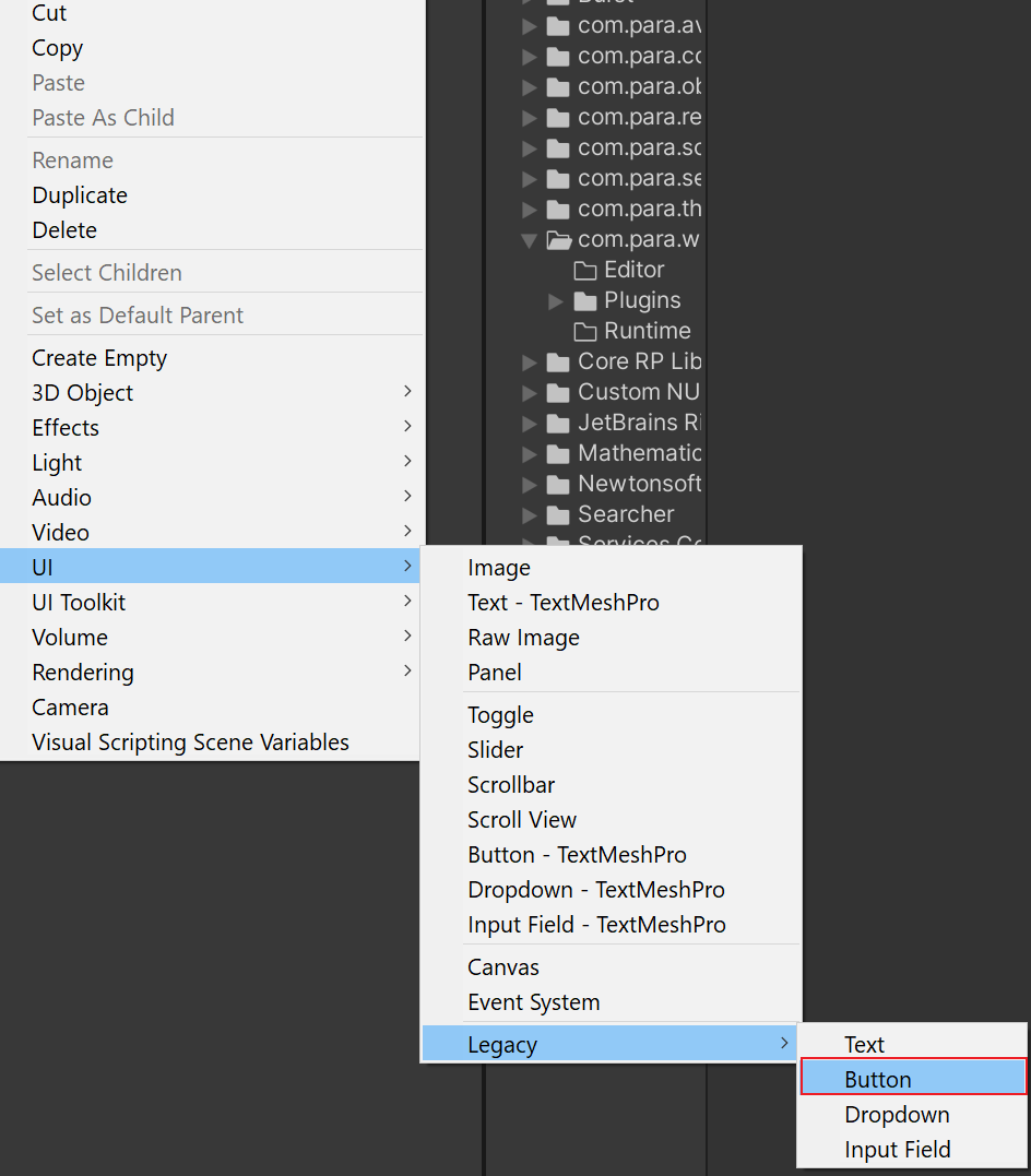
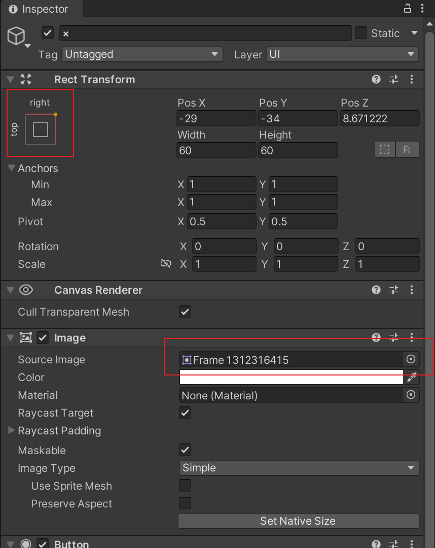
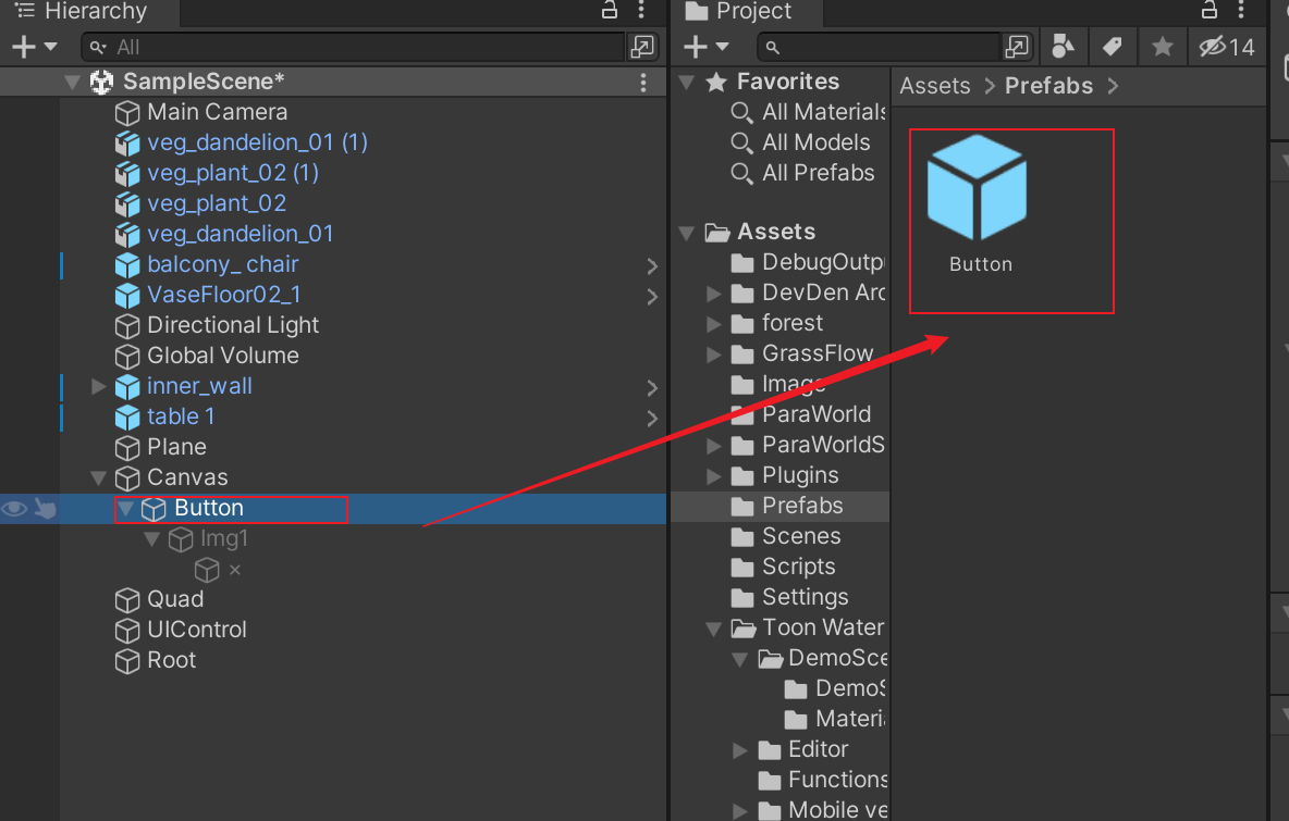
How to Configure a Custom Button That Opens a Page
- Create a button.
- Modify the icon size of the button in the Inspector window.
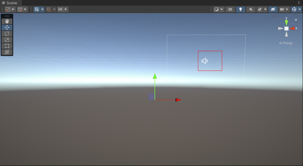
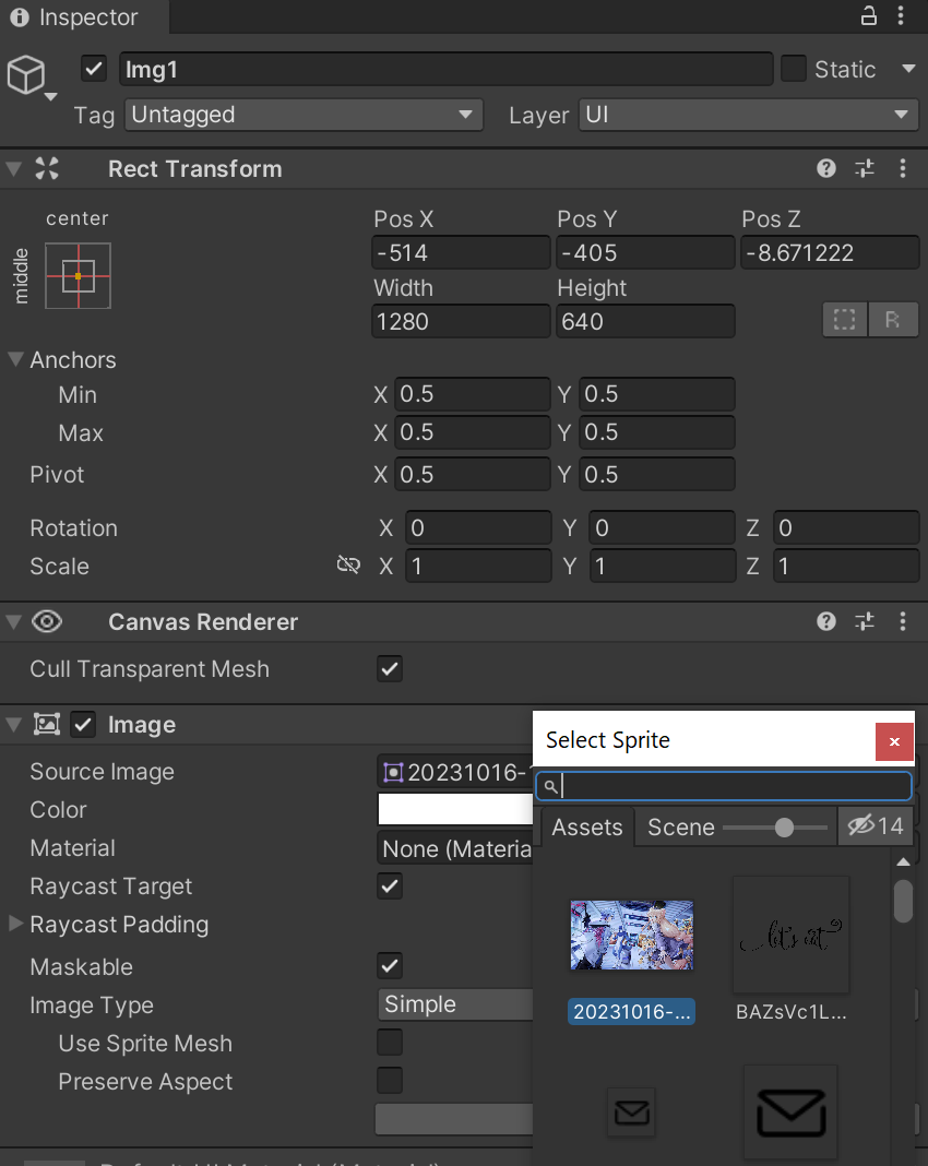
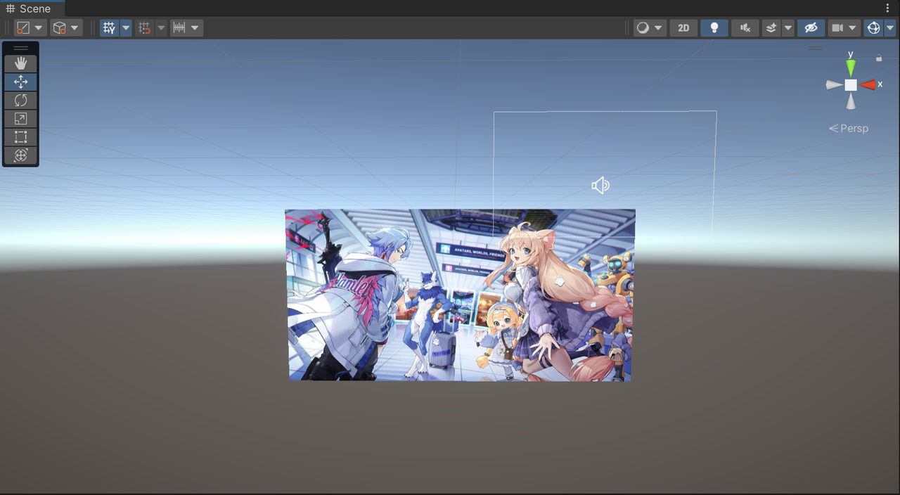
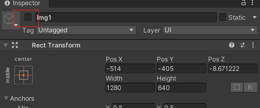
- Create an image under the button, name the image Img1, and adjust its content and size.
- Create an "x" button under the image for closing the image. Adjust the content and size of "x".

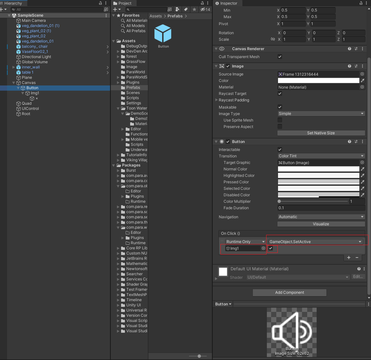
- Add methods to the two buttons that need to be operated.
- Edit the speaker button. Drag the image to be displayed to the node under On Click, select GameObject.SetActive, and select the check box. In this way, when you click the speaker button, the image will be activated and displayed.
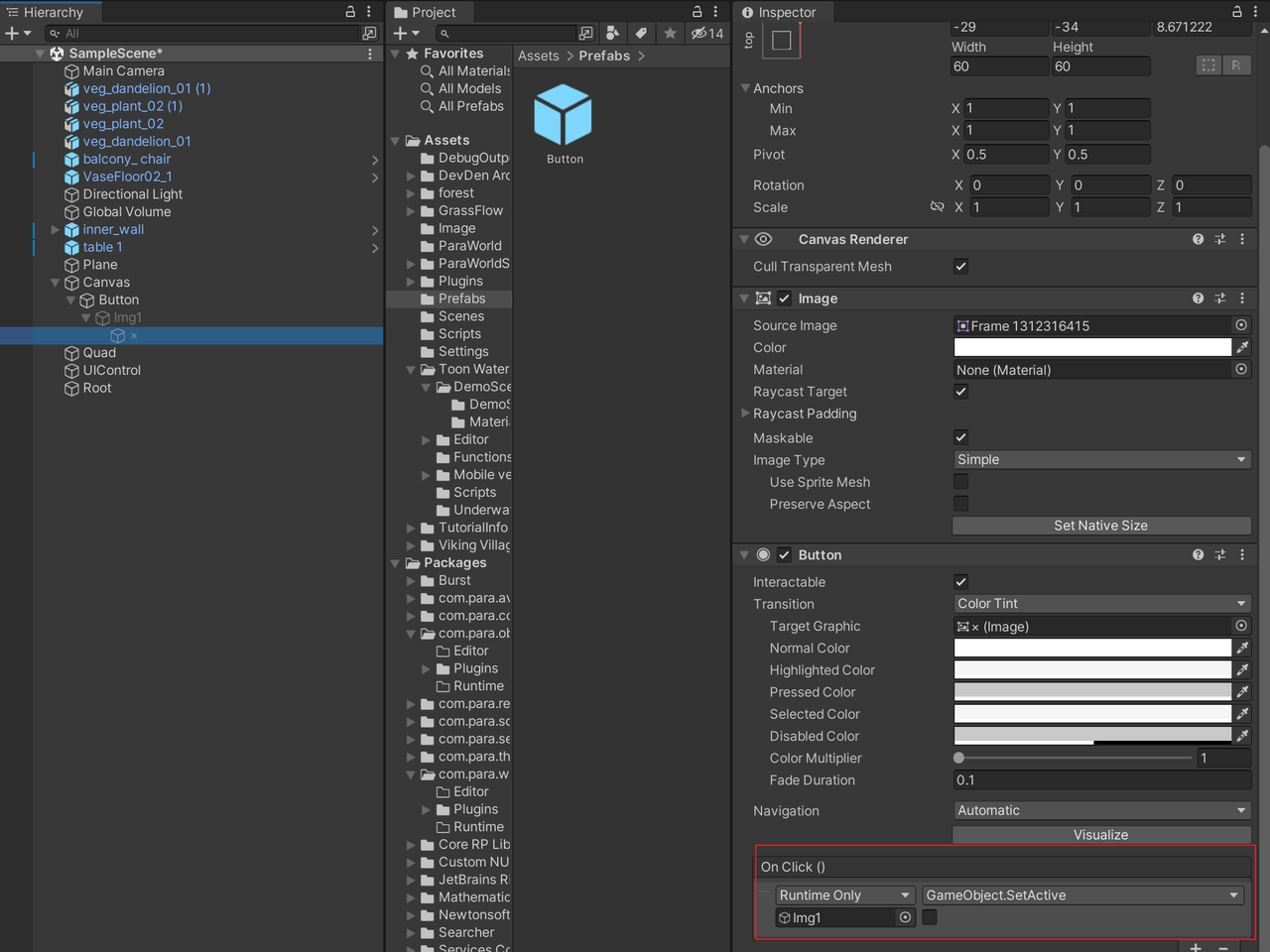
2. Edit the "x" button. Drag the image to be closed to the node under On Click, select GameObject.SetActive, and unselect the check box. In this way, when you click the "x" button, as the parent node can control the status of a child node, the image will be closed together with the "x" button.
- Edit the speaker button. Drag the image to be displayed to the node under On Click, select GameObject.SetActive, and select the check box. In this way, when you click the speaker button, the image will be activated and displayed.
- Unselect the check box on the left of Img1.
- Drag the speaker button to the Assets folder and save the button as a prefab.
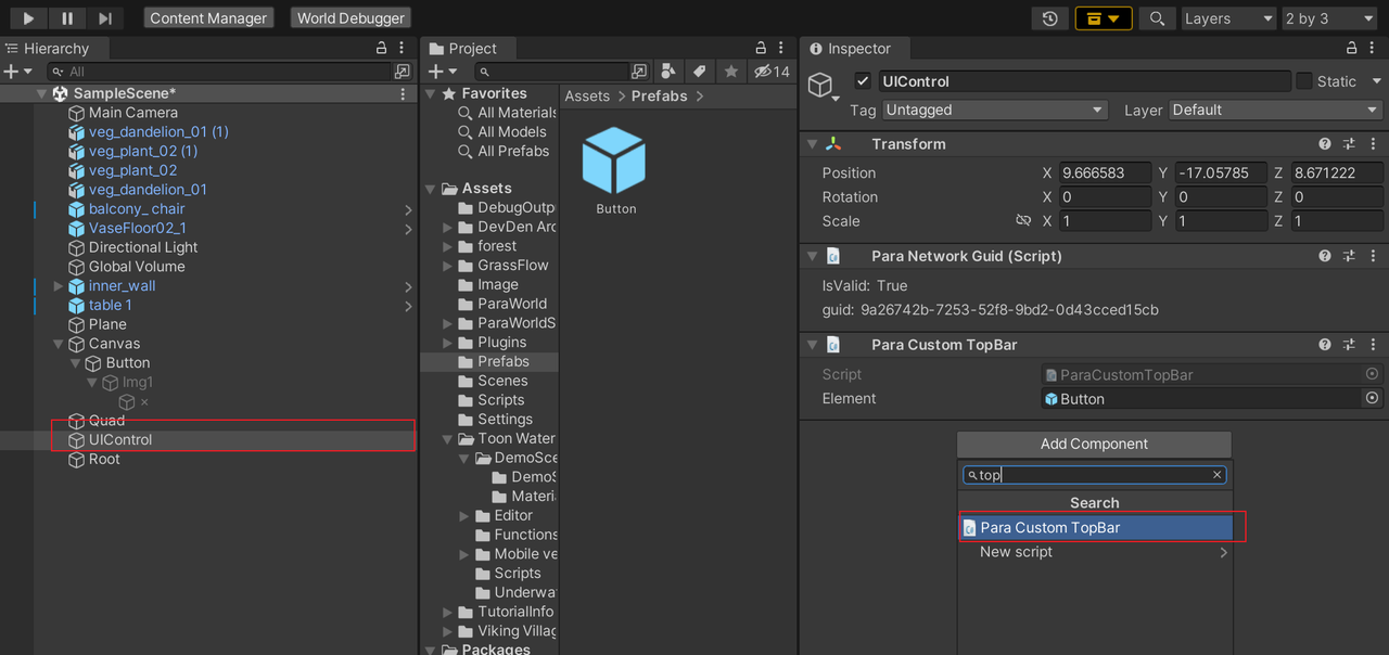
- Add a new empty node, name it UIControl, and add the Para Custom TopBar component to it. The component can automatically align a button to the upper-right corner and hide it when photos are being taken. Drag the button prefab to the Element input box.
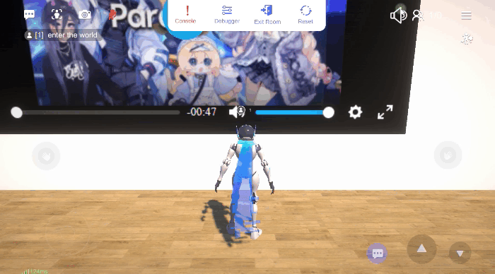
- Upload the World, then you can experience these custom buttons.
Updated about 1 year ago
Did this page help you?