The component is mounted on an object, so that the object's outline is displayed when something enters the object’s interactive range. Besides, it allows you to add a post-interaction behavior. All this makes it easier for you to create an interactive object in a world.
| Interaction Property Name | Property Description |
|---|
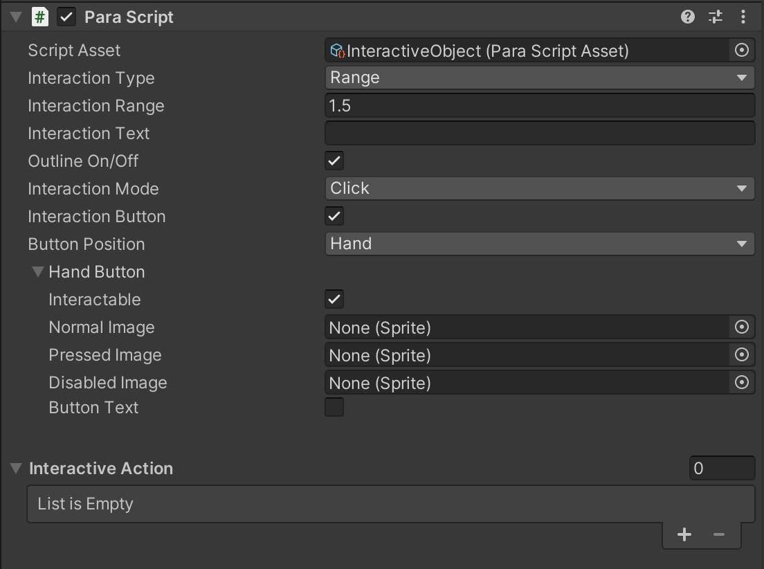
| Range | By selecting this type, you can generate a ball-shaped collider at the center of the object. Enter numbers to change the size of the range. |
| Area | By selecting this type, you can go to Interaction Collider and drag the custom collider to define the interactive range. |
| Interaction Property Name | Property Description |
|---|
| Interaction Text | Enters the text to be displayed on the interaction button. |
| Outline | When selected, the interactive object's outline will be displayed once something enters its range. |
| Interaction Property Name | Property Description |
|---|
| Click | Interactive behaviors are triggered only when the interaction buttons or the 3D objects within the scene are clicked. |
| Press | Interactive behaviors are triggered only when the interaction buttons or the 3D objects within the scene are pressed. |
| Click Up | Interactive behaviors are triggered only when the interaction buttons or the 3D objects within the scene are lifted. |
| Interaction Property Name | Property Description |
|---|
| Interaction Button | Specifies whether to display the interaction button. When selected, the interaction button is displayed with detailed properties expanded below. When unselected, the interaction button is not displayed. |
| Button Position | Specifies the button location. The available options are Hand and Addtive. The former indicates the hand button, while the latter indicates the assist button. You can select based on your demands. |
| Interactable | Specifies whether a button is interactable. It is selected by default. When unselected, the interaction button does not work. |
| Normal Image | Indicates the default image of a button. |
| Pressed Image | Indicates the image when a button is pressed. |
| Disabled Image | Indicates the image when a button is disabled. |
| Button Text | Specifies whether to display the text on an interaction button. When selected, the properties of the text are shown below. |
| Text | Enters the text to be displayed on a button. |
| Text Size | Enters the font size to change the text size. |
| Text Color | Changes the color and the Alpha value of text. |
📘The followings show how the two buttons are displayed on the page.

| Interaction Property Name | Property Description |
|---|
| Interactive Action | Sets the number of behaviors to be triggered. The default value is 0. |
| Data | Drags an object that contains a script. |
| Method Name | Enters the method name in an object's script to trigger a specific method. |